8 – Graphics
Figures
Suzan Last; David McMurrey; Kalani Pattison; James Francis, Jr.; Nicole Hagstrom-Schmidt; Matt McKinney; and Gia Alexander
Figures comprise several types of visuals. Examples include nearly any visual that is not text-heavy or a table, such as graphs, charts, maps, and diagrams. The following sections will cover the most common types of figures in detail, as well as their potential utility in technical and professional writing.
Types of Figures and Appropriate Uses
Different figure types have different strengths and uses. For example, you would not use a pie chart if you were presenting data that could not add up to 100%, and you would not use a bar graph to show the layout of a community garden. Table 8.1 lists common figure types used in technical writing, along with their general purpose or description. [1]
Table 8.1. Common types of illustrative graphics
| Type of Visual | Description and Purpose | |
|---|---|---|
| Graphs | Bar Graph | Compares and contrasts two or more subjects at the same point in time, or compares change over time. |
| Column Graph | Reveals change in a subject at regular intervals of time. | |
| Line Graph | Shows the degree and direction of change relative to two variables; compares items over time, shows frequency or distribution, or shows correlations. | |
| Charts | Pie Chart | Displays the number and relative size of the divisions of a subject; shows relation of parts to a whole (parts must sum to 100% to make sense). Typically pie charts will include between three and eight slices. |
| Organization chart | Maps the divisions and levels of responsibility or hierarchy within an organization. | |
| Flow Chart | Shows the sequence of steps in a process or procedure. | |
| Gantt Chart | Indicates timelines for multi-stepped projects, especially used in proposals and progress reports. | |
| Illustrations | Diagram | Identifies the parts of a subject and their spatial or functional relationship; emphasizes detail or shows dimensions. |
| Photo | Shows what a subject looks like in realistic detail or shows it being used. | |
| Animation | Simulates a process, operation, or incident. | |
| Film Clip | Depicts a process, operation, or incident in realistic detail. | |
Note: Notice the “box heads” on the top and “stubs” on the left are bolded and centered to enhance readability.
Common Uses of Graphics in Technical Documents
As with any writing decision, use your audience as your guide. Where in technical documents (such as instructions, reports, and proposals) could your reader benefit from visual clarification? Table 8.2 below reviews common types of information that may be clarified by the use of graphics.
Table 8.2. Common places for graphics in technical documents.
| What You are Writing | Graphic Ideas |
|---|---|
| Results of a survey question | Table, chart, or graph |
| Numeric data in relation to two or more things | Table, chart, or graph |
| Definitions of multiple terms | Table |
| Chain of command or relationships in an organization | Organization chart |
| A complex process or procedure | Flow chart |
| A timeline for completing a project | Gantt chart |
| An important piece of equipment | Photograph or diagram |
| A specific geographic location | Map |
If you’re not sure where you could incorporate a figure, remember that charts and graphs are just another way of presenting the same data that is presented in tables. The advantage of graphs and charts is that they are more dramatic and interesting; however, this strength may come at the cost of detail or precision, where tables excel. Imagine the difference between a table of sales figures for a ten-year period and a line graph for that same data. In the graph, you get a better sense of the overall trend but not of the precise dollar amount.
Drawings, Diagrams, Photos
To depict objects, places, people, and the relationships between them, you can use photos, drawings, diagrams, and schematics.
Major types of illustrations and photographs run from minimal to maximal detail. A simple line drawing of how to graft a fruit tree reduces the detail to simple lines representing the hands, the tools, the graft stock, and the graft. Diagrams are more abstract, schematic views of things; for example, a diagram of a car engine hardly resembles the actual physical thing at all. Photographs, of course, provide the most detail of all. These graphics, supplying gradations of detail as they do, have their varying uses. Here are some examples:
- In instructions, simple drawings (often called line drawings because they use just lines, without other detail such as shading) are the most common. They simplify the situation and the objects so that the reader can focus on the key details.
- In descriptions, you would want to use drawings, but in this case drawings with more detail, such as shading and depth perspectives.
- In feasibility, recommendation, and evaluation reports, photographs are often used. For example, if you are recommending a photocopier, you might want to include photos of the leading contenders.
The ethical responsibility to promote diversity arises when incorporating photographs into technical documents. When using photos, work to achieve a balance of representations throughout your document, including both men and women, older and younger people, people using assistive technology like wheelchairs and people of color.
Effective Formatting and Design for Figures
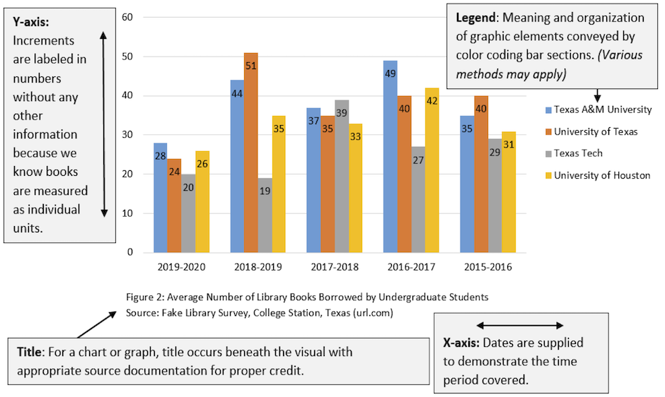
When you create charts and graphs, keep these requirements in mind (most of these elements are illustrated in Figure 8.3 [2]below):
Labels. Certain figures contain labels—words and phrases—with pointers to the parts of the things being depicted. In bar charts and line graphs, don’t forget to indicate what the x- and y- axes represent. One axis might indicate millions of dollars; the other, five-year segments from 1960 to the present.
Keys or Legends. If the illustration has certain shadings, colors, line styles, or other details that have a special meaning in the illustration, these should be indicated in a key or a legend—an area in an unused corner of the illustration that deciphers their meaning.
Titles. Except in special cases, illustrations should have titles, and these titles should be numbered (Figure 1, Figure 2, and so on). The exceptions are these:
-
- If you have lots of illustrations (for example, in certain instructions, there are illustrations practically after every paragraph) and if there is no benefit from the titles
- If you only have one or two illustrations and they are not cross-referenced
- If you do not cross-reference your illustrations.
In some of these cases, you might want to keep the title but discard the word “Figure” and the number following it. The title of a figure goes in a caption below the figure.
Cross-references. Almost all illustrations should be referred to from the relevant point in the discussion. Prior to providing the graphic, identify its purpose and explain any relevant details for your readers.
Location within the report. Figures should be placed just after the point where they are needed. However, sometimes because of the pagination (the way the text falls on the pages) and the size of the illustrations, this close placement is not possible. If this occurs, place the graphic at the top of the next page. Your figure numbers and cross-referencing will make it clear what information the graphic is associated with.
Size of illustrations. Ideally, you want illustrations to be between one-quarter to one-half of the vertical size of the page. You also want them to fit on the page with other text. In fact, that’s what you really want—to intersperse text and graphics in a report. Extremely large figures may need to be resized, revised to focus on specific information, or placed on their own page.
Placement within margins. Make sure that your illustrations fit neatly and comfortably within standard (usually one-inch) margins. You don’t want the illustration spilling over into the right or left margins. You want to allow the equivalent of at least two blank lines above and below the illustration.
Level of technical detail. Design your figures to be at the right technical level for your readers. For example, a chip circuitry diagram for an audience of computer beginners would likely be too complex.
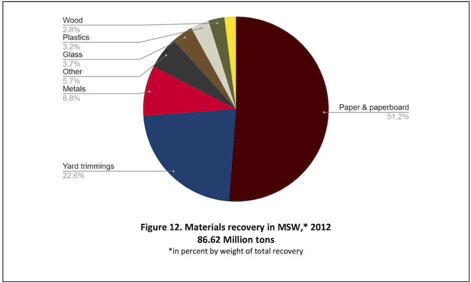
Design. Avoid unnecessarily convoluted, distracting, or misleading design elements. For instance, don’t use 3D for figures such as pie charts or bar graphs. A 3D pie chart can distort the impression that the size of the slices makes, and 3D bar graphs can make it difficult for the reader to tell whether to read from the “front” or the “back” of the bar. See Figure 8.4[3] for a good example of a pie chart with clear slices, labelling, and design.
Accessibility/Usability. Be sure that your figures are accessible to a wide variety of readers and in a variety of formats. In addition to using actual text rather than pictures of text and including alternative text where needed, choose your colors wisely. While different shades of the same color may look nice, those shades may be easily misread if they are too similar. Combinations of red and green or yellow and blue may make it difficult for those with the most common types of color-blindness to determine the figure’s meaning. Remember that clear communication is the most important consideration in design choices.
This text was derived from
Last, Suzan, with contributors Candice Neveu and Monika Smith. Technical Writing Essentials: Introduction to Professional Communications in Technical Fields. Victoria, BC: University of Victoria, 2019. https://pressbooks.bccampus.ca/technicalwriting/. Licensed under a Creative Commons Attribution 4.0 International License.
McMurrey, David. Online Technical Writing. n.d. https://www.prismnet.com/~hcexres/textbook/. Licensed under a Creative Commons Attribution 4.0 International License.
- For a detailed discussion of how and when to use these kinds of visuals, see H. Graves and R. Graves, “Communicating through Visuals,” in A Strategic Guide to Technical Communications, 2nd ed. (Peterborough, ONT: Broadview Press, 2011), 137-148. ↵
- James Francis and Sarah LeMire, “Example of a Graph,” 2020. Licensed under a Creative Commons Attribution-NonCommercial-ShareAlike 4.0 International License. ↵
- U.S. Environmental Protection Agency, Office of Resource Conservation and Recovery, “Figure 12. Materials recovery in MSW,* 2012 86.62 Million tons,” in Municipal Solid Waste Generation, Recycling, and Disposal in the United States Tables and Figures for 2012, February 2014, 46. https://archive.epa.gov/epawaste/nonhaz/municipal/web/pdf/2012_msw_dat_tbls.pdf ↵
Open Educational Resources (OER), like this one, rely on working within copyright law using tools, such as Creative Commons (CC) licenses, to enable frictionless sharing and collaboration that would otherwise be difficult to manage from an intellectual property perspective. Open licenses tell others how they can use your work by explicitly granting them copyright permissions to share and adapt your work, with CC licenses being the gold standard in interoperable open licenses for content. This section explains essential aspects of copyright, Creative Commons licenses, and openly licensed content.
Copyright law varies quite widely between countries and has changed over time, particularly in how long a work remains protected by copyright law. The information in this chapter deals with U.S. copyright law. If you ever work for an international company or work with creative content produced in another country, you need to read any contracts carefully, as they may have different regulations and expectations regarding intellectual property.
Why is Copyright Important?
The copyright status of a work will (along with other factors) determine what you can and cannot do with someone else’s creative work. U.S. copyright law and patent law were originally established as part of the U.S. Constitution in order to encourage creativity and innovation. Copyright law helps ensure that creators are compensated for their work, which allows them to continue to invent and create.
In the U.S., creative works are often categorized regarding their potential use under copyright law: fully protected by copyright, in the public domain, and licensed for Creative Commons (CC) use. Knowing how to identify and differentiate between these common relationships of works to copyright will be useful when determining what content you may reuse and how.
Under current copyright laws, anything written or created is automatically protected from the moment of its creation provided it meets the criteria for copyright. There is no necessary paperwork, form, or registration to complete–if your six-year-old cousin draws a picture for you and writes a letter to you, that picture and letter would be protected by copyright.
According to Title 17 of the United States Code (The Title related to copyright law), Copyright protection applies to:
original works of authorship fixed in any tangible medium of expression, now known or later developed, from which they can be perceived, reproduced, or otherwise communicated, either directly or with the aid of a machine or device. Works of authorship include the following categories:
-
-
- literary works;
- musical works, including any accompanying words;
- dramatic works, including any accompanying music;
- pantomimes and choreographic works;
- pictorial, graphic, and sculptural works;
- motion pictures and other audiovisual works;
- sound recordings; and
- architectural works.[1]
-
The “fixed” requirement to copyright reflects that ideas, facts, or concepts are not protected. This is why sometimes it seems as if different movies or books have the same plots or the same type of character. Using someone else’s ideas or concepts without giving credit doesn’t violate copyright law (a legal issue) but is actually plagiarism (an ethical issue). Giving credit for the source of ideas, facts, and concepts is an ethical necessity, but re-using a “fixed” version of a work protected by copyright, even if you give credit (outside of certain situations–see below), is a copyright violation.
Copyright
The rights to fully copyrighted works a.k.a. All Rights Reserved (ARR) are held by the creator(s) of the work. It can be unlawful to use copyrighted works of others without their permission, and no permissions are granted in the case of ARR works. Activities such as copying, modifying, publicly displaying, publicly performing, and distributing copies of ARR work may be illegal unless legal permission is granted by the creator.
You may have seen copyright marks or statements at the beginning of books or in the credits of a film, often in the format of “Copyright [creator name] [year]” and with the Copyright symbol (see Figure 8.8[2]). These marks can be useful, but due to the automatic nature of copyright, works that have no marking should be seen as having all rights reserved—no permissions granted until you are granted them specifically from the owner of the rights.

Public Domain (PD)
Work in the public domain (PD) can be reused freely for any purpose by anyone, without legally having to give credit or attribution to the author or creator, though for reasons pertaining to ethos (establishing your own credibility and reliability) and ethics (avoiding plagiarism, misattribution, and unfairness) attribution should still be given whenever possible. With few exceptions, such as being unable to claim the PD work of others as your own, works in this category can be used with great confidence, as copyright has either expired or the works were produced by the U.S. Federal Government, and so entered the U.S. PD immediately after creation or publication.
Currently in the U.S. (and in all works created in the U.S. since January 1, 1978) creative works enter the public domain 70 years after the death of the creator or 95 years after publication or 120 years after creation, (whichever expires first) if it is a work made for hire, anonymous, or pseudonymous. Work “made for hire” is work done for and under the direction of a company. Individual animators at a film studio, for instance, don’t own the copyright for their work–the company does. Whether individuals or companies own the copyright to work created in the workplace depends a lot on disciplines, fields, and locations. Occasionally, employment contracts even extend the company’s copyright to works created by the employee unrelated to the individual’s job. Be sure to read any contract carefully to see who will own the work you create.
Works published before 1978 and after the 1920s mostly had an original 28 year protection, followed by an renewal which may or may have been automatically given–works created before 1926 are all in the public domain (as of 2021).
Creative Commons (the organization) created a legal tool called CC0 (pronounced "see-see-zero") to help creators place their work as close as possible to the public domain by releasing all rights to it. The following Figures 8.9[3] and 8.10[4] demonstrate what two marks you may find on certain works to convey the rights of public domain.

Creative Commons (CC)
Creative Commons (CC) is a non-profit organization that offers free legal tools to make creative work more shareable. Composed of combinations of four different elements (see Table 8.3 for a description of each major element[5]), there are six different CC licenses that explicitly grant permission for others to use your work in certain ways, forming a spectrum of openness. The most open CC licenses require only attribution (giving credit), but otherwise permits nearly any use imaginable. The less open licenses include components that limit or prevent commercial reuse and modification.
CC license marks are visible symbols telling others that work can be reused without requiring direct contact or permission from the creator. Properly applied to digital content, a CC license contains a link to a human-readable description of the license with a further link to the legal deed behind the license. (See Table 8.4[6]).
Table 8.3. Creative Commons elements
| Creative Commons Element Type | Meaning | Creative Commons Image |
|---|---|---|
| BY | Credit must be given to the creator |  |
| SA (ShareAlike) | All adaptations must be shared using the same licenses. |  |
| NC (NonCommercial) | Only noncommercial uses of the work are permitted |  |
| ND (No Derivatives) | No derivatives or adaptations of the work are permitted. The work may not be altered by future users. |  |
Table 8.4. Creative Commons Licenses
| License Type | Description of license from Creative Commons. | Creative Commons Image |
|---|---|---|
| CC BY | This license allows reusers to distribute, remix, adapt, and build upon the material in any medium or format, so long as attribution is given to the creator. The license allows for commercial use. |  |
| CC BY-SA | This license allows reusers to distribute, remix, adapt, and build upon the material in any medium or format, so long as attribution is given to the creator. The license allows for commercial use. If you remix, adapt, or build upon the material, you must license the modified material under identical terms. |  |
| CC BY-NC | This license allows reusers to distribute, remix, adapt, and build upon the material in any medium or format for noncommercial purposes only, and only so long as attribution is given to the creator. |  |
| CC BY-NC-SA | This license allows reusers to distribute, remix, adapt, and build upon the material in any medium or format for noncommercial purposes only, and only so long as attribution is given to the creator. If you remix, adapt, or build upon the material, you must license the modified material under identical terms. |  |
| CC BY-ND | This license allows reusers to copy and distribute the material in any medium or format in unadapted form only, and only so long as attribution is given to the creator. The license allows for commercial use. |  |
| CC BY-NC-ND | This license allows reusers to copy and distribute the material in any medium or format in unadapted form only, for noncommercial purposes only, and only so long as attribution is given to the creator. |  |
There are many sites that publish collections of images or other media using the CC0 licensing or other CC licenses. If you are looking for works to incorporate into your own (for entertainment, work-related presentations, etc.), these are a good place to start. Another source of media and images is Wikimedia Commons–the repository for images and media used on Wikipedia. Always look for the specific license that a work is published under on the original webpage, rather than trusting an “image search,” and scroll down on the relevant Wikimedia page to see the specific license and requirements given.
Overall, copyright protection and various licenses provide a range of openness for various works.
Fair Use
Fair use is not a copyright status but a copyright principle that suggests that the public can make certain uses of works still protected by copyright without permission. According to Title 17, Chapter 1, section 107, works can be used without violating copyright “for purposes such as criticism, comment, news reporting, teaching (including multiple copies for classroom use), scholarship, or research.”[7]
Whether or not a specific use falls under Fair Use is determined by four factors:
- the purpose and character of your use,
- the nature of the copyrighted work,
- the amount and substantiality of the portion taken, and
- the effect of the use upon the potential market.[8]
You should use these principles to make your best determination regarding fair use, but fair use can be complicated and interpreted in different ways by different courts and judges, so be cautious.
Thus far in your life, your use of media has most likely been covered by “educational fair use,” that is, fair use for the purposes of teaching or scholarship. For instance, if you ever googled an image to insert as part of a class presentation and used a popular image that was likely protected by copyright, your use of the image would have been considered fair use because it was part of a “teaching” scenario. If, however, you were to find that same popular image and use it in a work-related presentation, then you would most likely be considered in violation of copyright. Out of the context of non-profit education, you need to be much more careful about how you find and repurpose media.
In order to avoid getting yourself (or your company) into legal trouble, be very careful how you use text, images, media, clips, and even memes within the workplace or when creating materials for your workplace, and be sure to consult with your company’s lawyers when necessary.
Regardless of copyright status—whether you are using works in the public domain, licensed with Creative Commons licensing, or protected by copyright—remember that you are obligated to cite your sources for media (images, sounds, clips), tables, charts, and graphs just as you are for the words you borrow, or you risk plagiarism (and ethical violation) even if you aren’t breaking the law. Normally, this is done in either the table title or in a footnote just below the table. Figure 8.3 is an example in this chapter.
For more information on citing sources of information and details on the contents of source citations, see Chapter 12: Avoiding Plagiarism and Citing Sources Properly.
This text was derived from
Meinke, William. “Copyright, Creative Commons, and Public Domain.” In UH OER Training. University of Hawai’i Outreach College, 2018. https://pressbooks.oer.hawaii.edu/oertraining2018/chapter/copyright-creative-commons-and-public-domain/. Licensed under a Creative Commons Attribution 4.0 International License.
[["Abstract Noun","Verb"],["acquisition","acquire"],["analysis","analyze"],["recommendation","recommend"],["observation","observe"],["application","apply"],["confirmation","confirm"],["development","develop"],["ability","able, can"],["assessment","assess"]]
Properly formatted APA citations include two main elements: the reference list entry and the in-text citation. Below you will find sample citations for a variety of commonly-used reference types. For additional questions, consult the Publication Manual of the American Psychological Association (7th ed.)[9]
Reference List
The reference list is found at the end of your document, and it includes all of the sources used when developing your paper or project. References are listed in alphabetical order by the author’s last name, and each reference will have a hanging indent to make it easier to visually distinguish between each reference.
No Author
If there is no author, the title moves into the place of the author. The reference should then be alphabetized by the first word in the title within the reference list. If the first word is an article (“a,” “an,” or “the”), alphabetize according to the second word. If the first word is a number, alphabetize according to the spelling of the number. (For example, if the first word is “665,” you would alphabetize it as if it were “six-hundred and sixty-five.”
Example
Down the Line. (1895). In The Olio: An Annual (pp. 54-58). The Corps of Cadets of the Agricultural and Mechanical College of Texas.
Single Author
In APA style, when there is a single author, you should list them with the last name first, followed by the first and (if available) middle initial.
Example
Clark, D. T. (2009). Lending Kindle e-book readers: First results from the Texas A&M University project. Collection Building, 28(4), 146-149. https://doi.org/10.1108/01604950910999774
Two Authors
When there are two authors, list both and connect them with an ampersand (&). Be sure to keep the authors in the order in which they appear on the source.
Example
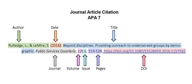
Rutledge, L., & LeMire, S. (2016). Beyond disciplines: Providing outreach to underserved groups by demographic. Public Services Quarterly, 12(2), 113–124. https://doi.org/10.1080/15228959.2016.1157565
Three to Twenty Authors
When there are between three and twenty authors, list each one and use an ampersand (&) before the final author. Be sure to keep the authors in the order in which they appear on the source.
Example
LeMire, S., Graves, S. J., Hawkins, M., & Kailani, S. (2018). Libr-AR-y Tours: Increasing engagement and scalability of library tours using augmented reality. College & Undergraduate Libraries, 25(3), 261–279. https://doi.org/10.1080/10691316.2018.1480445
Twenty-One or More Authors
When there are more than twenty authors, list the first nineteen authors, then add an ellipsis (…) and the last author’s name. The ellipsis (…) will take the place of author names between author number nineteen and the final author. Be sure to keep the authors in the order in which they appear on the source.
Example
Agnese, R., Anderson, A. J., Asai, M., Balakishiyeva, D., Thakur, R. B., Bauer, D. A., Beaty, J., Billard, J., Borgland, A, Bowles, M.A., Brandt, D., Brink, P.L., Bunker, R., Cabrera, B., Caldwell, D.O., Cerdeno, D.G., Chagani, H., Chen, Y., Cherry, M., ... Zhang, J. (2014). Search for low-mass weakly interacting massive particles with SuperCDMS. Physical Review Letters, 112(24), 241–302. https://doi.org/10.1103/PhysRevLett.112.241302
Institutional Author
Sometimes the author isn’t a person—instead, the source is authored by an organization. In this case, you’ll list the organization as the author.
Example
Texas A&M University. (2019). Aggie traditions. https://www.tamu.edu/traditions/index.html
Book
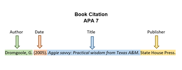
Books list the author, followed by the year, and then the title in italics. The title is in sentence case, which means that you only capitalize the first word, any proper nouns or adjectives, and the first word after a colon or period. APA also includes the publisher name. If the book is accessed electronically, also include the digital object identifier (doi). Figure 12.1[10] illustrates the components of a book citation in APA format.
Example
Article from a Database
Articles from online databases like Google Scholar or EBSCO include the author names, year of publication, and article title in sentence case. For the journal title, follow the capitalization provided by the journal itself. The journal title and the volume number are in italics. The issue is in parentheses, followed by the page range.
To help the reader access the article, always include the doi (permanent url) if one is available. It is generally listed near the top of the article. It may appear as doi: or https://dx.doi.org/ followed by a sequence of numbers and/or letters. The doi number typically starts with the number 10, as in the example below. If there is a doi available, include it in your citation using the format https://doi.org/[insert doi number]. Figure 12.2[11] illustrates the components of a journal article citation in APA format.
Example
Newspaper Article
If a newspaper article is found in a database such as Newspaper Source or Access World News, do not include the database name or URL. If the article is found through the open web, include the URL.
If an article is from an online newspaper (for example, Washington Post, New York Times, Wall Street Journal), italicize the name of the newspaper. If the article is from an online news website (e.g. BBC News, CNN, Reuters), italicize the name of the article and not the site.
Example from an online newspaper
Boren, C. (2018, November 25). It took seven overtimes for Texas A&M to beat LSU in the craziest college football game of the year. Washington Post. https://www.washingtonpost.com/sports/ 2018/11/25/it-took-seven-overtimes-texas-am-beat-lsu-craziest-college-football-game-year/
Example from an online news website
Holcombe, M. (2019, July 18). Texas A&M's new program opens the door to college education for students with disabilities. CNN. https://www.cnn.com/2019/07/18/us/texas-am-program- disabilities/index.html
Website
Example
Texas A&M University Division of Student Affairs. (2019). Residence life. https://reslife.tamu.edu/
YouTube Video
Example
Texas A&M University. (2019, September 8). Fearless on every front [Video]. YouTube. https://www.youtube.com/watch?v=YlRup0e8kTk
Interview
In APA format, an unpublished interview is not included in the reference list. This is because the interview is not available for the reader to view. Instead, interviews are cited only in-text.
Lecture
In APA format, if you are citing your professor’s lecture slides or content, you should point the reader to a digital copy of that content if possible. If housed in a course management system, direct the reader to the login page for that system.
Example
Pantuso, T. (2019, September 10). Visual rhetoric [PowerPoint slides]. eCampus. https://ecampus.tamu.edu/
In-Text Citations
APA in-text citations use the last name(s) of the author(s), followed by a comma and the year of publication. If using a direct quotation, also include the page number where that quotation can be found. The abbreviation “p.” precedes any page numbers. These items are all separated by commas.
In APA format, you can also embed the in-text quotation directly into your sentence (for example, Smith (2001) found that…), which then obviates the need for a parenthetical at the end of the sentence, except in the case of a direct quotation.
No Author
As with the reference list, the in-text citation will use the title if there is no author available. Use the first few words of the title if it is long, and place it in quotation marks.
Example
(“Down the Line,” 1895).
Single Author
If the work has a single author, use the author's last name, followed by a comma and the year of publication.
Example (no direct quotation)
(Clark, 2009)
Example (direct quotation)
(Clark, 2009, p. 42)
Two Authors
When there are two authors, list the last names of both connected by an ampersand (&). Be sure to keep the authors in the order in which they appear on the source.
Example
(Rutledge & LeMire, 2016).
Three or More Authors
When there are three or more authors, list the first author’s last name, followed by et al. This is a Latin phrase meaning “and others” and used in some citation formats as a way to abbreviate a list of names. Notice that the switch to “et al.” occurs after three authors when using in-text citations. In your References list, you will include up to twenty authors.
Example
(Tribble et al., 2002).
Institutional Author
As with the reference list, you’ll list the organization as the author in the in-text citation.
Example
(Texas A&M University, 2019).
This text was derived from
Deborah Bernnard, Greg Bobish, Jenna Hecker, Irina Holden, Allison Hosier, Trudi Jacobson, Tor Loney, and Daryl Bullis. The Information Literacy User’s Guide: An Open, Online Textbook, edited by Greg Bobish and Trudi Jacobson. Geneseo, NY: Open SUNY Textbooks, Milne Library, 2014. http://textbooks.opensuny.org/the-information-literacy-users-guide-an-open-online-textbook/. Licensed under a Creative Commons Attribution-NonCommercial-ShareAlike 3.0 Unported License.
Pantuso, Terri, and Sarah LeMire and Kathy Anders, eds. Informed Arguments: A Guide to Writing and Research. Rev.2nd ed. College Station, TX: Texas A&M University, 2022. Licensed under a Creative Commons Attribution-NonCommercial-ShareAlike 4.0 International License, except where otherwise noted.
Drafting is the stage of the writing process in which you develop a complete version of a document. Even professional writers admit that an empty page intimidates them because they feel they need to come up with something fresh and original every time they open a blank document on their computers. Because you have completed the prewriting and outlining stages, you have already generated ideas for both content and organization. These pre-writing strategies will therefore make the drafting process substantially easier.
Goals and Strategies for Drafting
Your objective at this stage of the writing process is to compose a version of your document that contains all the necessary main sections. A draft is a complete version of a piece of writing, but it is not the final version. As you may remember, the step in the writing process that comes after drafting is revising. During revising, you will have the opportunity to make changes to your first draft before putting the finishing touches on it during the editing and proofreading stage. A first draft provides a working version that you will improve upon later.
If you have difficulty beginning your draft on the computer, you might choose to start out on paper and then type before you revise. You could also type using a font in your background color to make your writing invisible so that you don’t become preoccupied with minor errors as you generate content. If you have difficulty writing or typing, consider using a voice recorder or voice recording app on your phone to get started. Dictate each section to get the information out of your head, and then either type or use a speech-to-text program to get your recordings into written words. Newer versions of Word also contain this feature if you prefer to dictate directly onto a document.
Depending on your English (or whichever language required for the document) proficiency, you can complete a draft in another language and translate it afterward. Another option would be to write your draft mostly in English but to use phrases or sentences more familiar to you in another language when you have difficulty figuring out how to express an idea in English. You can translate those parts later.
The point is this: For the very first draft (a draft no one else will see), get the ideas into the document in whatever manner works best for you. Stick to the outline you create and include all of the information you plan, but don’t stifle yourself by expecting the first draft to be perfect or even understandable to anyone else.
Making the Writing Process Work for You
The following approaches, implemented alone or in combination with others, may improve your writing and help you move forward in the writing process if you get stuck:
Begin writing with what you know the most about. You can start with the third section in your outline if those ideas come to mind easily. You can start with the second section or the second paragraph of the third section, too. Although paragraphs may vary in length, remember that in technical and professional writing, paragraphs are expected to be short and to the point. A three-sentence paragraph is more common and expected than paragraphs in academic writing, which shouldn’t be longer than one double-spaced page.
Write one section at a time, and then reevaluate what to write next. Choose how many paragraphs you complete in one sitting as long as you complete the assignment on time. Pace yourself. On the other hand, try not to procrastinate. Writers should always meet their deadlines.
Take short breaks to refresh your mind. This tip might be most useful if you are writing a multi-page report. Furthermore, if you cannot concentrate, take a break to let your mind rest, but do not let breaks extend too long. If you spend too much time away from your document, you may have trouble starting again. You may forget key points or lose momentum. Try setting an alarm to limit your break, and when the time is up, return to your workstation to write. In fact, if you need to take a break, it is often most useful to stop in the middle of a sentence or a paragraph so that it is easier to pick up momentum again rather than having to start a new section.
Be reasonable with your goals. If you decide to take ten-minute breaks, try to stick to that goal. If you tell yourself that you need more facts, then commit to finding them. Holding yourself accountable to your own goals will help you to create successful writing assignments. Keep a list of things to finish/fix later or use a tool like comments in Google Docs to make a note when you think of something to do so that you keep track of such items without losing your place or momentum.
Keep your audience and purpose in mind. These aspects of writing are just as important when you write a single paragraph for a document as when you consider the direction of the entire document.
As discussed at the beginning of this chapter, reminding yourself of the rhetorical situation, particularly purpose and audience, will lead to writing success. If your purpose is to persuade, for example, you will present facts and details in the most logical and convincing way possible. The purpose will guide your mind as you compose sentences, and your audience awareness will guide your word choice. Are you writing for experts, for a general audience, for other college students, or for people who know very little about your topic? Keep asking yourself what your readers, with their background and experience, need to be told in order to understand your ideas. How can you best express your ideas so they are completely clear and your communication is effective?
Drafting Paragraphs
Topic sentences indicate the location and main points of the basic arguments of your document. These sentences are vital to writing your body paragraphs because they always refer back to and support the main purpose of your section. Topic sentences are linked to the ideas you introduce in your heading or section, thus reminding readers what your document is about and helping to convey how the information within each section is organized. A paragraph without a clearly-identified topic sentence may be unclear and scattered, just like an essay without a thesis statement.
Each body paragraph should contain a topic sentence sentence and supporting details (examples, reasons, and/or arguments). The topic sentence for each paragraph should state one specific aspect of the main section, and then the following sentences should expand upon that aspect with adequate support. In other words, each topic sentence should be specific and supported by concrete details, facts, and/or explanations that you provide throughout the course of the paragraph.
You may be accustomed to academic writing in which you have the option of writing your topic sentences in one of three ways. You can state it at the beginning of the body paragraph, at the end of the paragraph, or not at all as an implied topic sentence. An implied topic sentence lets readers form the main idea for themselves. For beginning writers, it is best not to use implied topic sentences because they make it harder to focus your writing. In technical and professional writing, always start body paragraphs with topic sentences. BLOT (Bottom Line on Top) is a useful acronym to help you remember how to structure a paragraph. Use topic sentences to tell readers what you most want them to know/remember (this is the “bottom line”), and then use the rest of the paragraph to support those ideas. Remember that clearly conveying information in a way that is easy to read quickly is a main goal of most writing.
Drafting Introductory and Concluding Sections
The goal of the introduction is to give readers everything they need to know in order to understand what your purpose is and to follow the arguments you present in the rest of the document. Picture your introduction as a storefront window. You have a certain amount of space to attract your customers (readers) to your goods (topic) and bring them inside your store (discussion). Once you have enticed them with something intriguing, you then point them in a specific direction and try to make the sale (persuade them to accept your proposal or purpose). The introduction is an invitation to readers to consider what you have to say and then to follow your train of thought as you expand your argument.
Writing an Introduction
An introduction serves the following purposes:
- Establishing voice and tone, or attitude, toward the subject
- Introducing the general topic of the document
- Stating the ideas that will be discussed in the remaining sections of the document
First impressions are crucial and can leave lasting effects in a reader's mind, which is why the introduction is so important to a document. If an introduction is dull or disjointed, a reader may be confused or start out in an antagonistic position to your goal.
Writing a Conclusion
It is not unusual to want to rush when you approach a conclusion, and even experienced writers may find themselves exhausted. However, good writers remember that it is vital to put just as much attention into the conclusion as into the rest of the document. After all, a hasty ending can undermine an otherwise persuasive document. Think about how many “great” movies become “good” because of a lackluster ending.
Not all documents have formal conclusion sections. Technical and professional documents may end with recommendations, next steps, the discussion section of a lab report, or the closing of a letter. However, the end of a document does have to contain certain characteristics to provide a solid and persuasive ending. Whether it is a formal conclusion or not, an ending section that does not correspond to the rest of a document can unsettle your readers and raise doubts about your purpose or argument. However, if you have worked hard to write the earlier sections of a document, the conclusion can often be the most logical part to compose.
Avoid doing any of the following in your conclusion:
Introducing new material. Introducing new material in a conclusion has an unsettling effect on readers. Raising new points makes a reader want more information, which cannot be provided in the limited space of a final paragraph.
Contradicting your earlier statements. Contradicting or changing earlier statements or logical conclusions causes readers to think that you do not hold a strong conviction about your topic. After all, you have spent several sections persuading readers toward a specific point of view, so don’t undercut your argument at the end.
Remember that a first draft (or even a second or third) is just a draft. Before the document can truly be considered finalized, you need to complete the last two steps of the writing process: revising and editing, which are covered in Chapter 10.
This text was derived from
Weaver, Rebecca, Lynne Bost, Michelle Kassorla, Karen McKinney-Holley, Kathryn Crowther, Lauren Curtright, Nancy Gilbert, Barbara Hall, Tracienne Ravita, and Kirk Swenson. Successful College Composition, 3rd Edition. (2016). English Open Textbooks. 8. https://oer.galileo.usg.edu/english-textbooks/8. Licensed under a Creative Commons Attribution-NonCommercial-ShareAlike 4.0 International License.
While formatting may seem to be of lesser importance than content, the way that something looks conveys the first impression your reader has of your work. Making sure that your formatting is clear, logical, and consistent can be compared to dressing professionally for a job interview. You want your first impression to be a strong one. Use formatting to ensure that your reader knows you are serious about and proud of your work: you care enough about your own ideas to make sure that they are easy to navigate, that they are ordered logically, and that they are polished visually.
Page Numbering
Page numbering (or pagination) is an expectation for any major written source that uses pages. Depending on your style, you may use a combination of Roman numerals (i, ii, iii…) and Arabic numbers (1, 2, 3). Below are key points to remember when paginating your document:
- All pages in the report (within but excluding the front and back covers) are numbered, but on some pages, the numbers are not displayed. Microsoft Word and Google Docs allow you to present the page numbers in this way, but other word processors may require you to compose the report’s parts in different documents, save them as PDFs, and then combine the PDFs.
- On special pages, such as the title page, page numbers are not displayed.
- In the contemporary design format, all pages throughout the document use Arabic numerals; in the traditional design format, all pages before the introduction (or the first page of the body of the report) use lowercase Roman numerals.
- Page numbers can be placed in one of several areas on the page. Usually, the best and easiest choice is to place page numbers at the bottom center of the page. (Remember to hide or remove them on special pages!)
Headings
In all but the shortest reports (two pages or less, and often even then), use headings to distinguish the different topics and subtopics covered. Headings are an important feature of professional and technical writing: they alert readers to upcoming topics and subtopics, help readers find their way around in long reports and skip what they are not interested in, and break up long stretches of text.
Headings are also useful for writers. They keep you organized and focused on the topic. Indeed, headings are like the parts of an outline that have been pasted into the actual pages of the document. When you begin using headings, your impulse may be to add in the headings after you've written the rough draft. Instead, visualize the headings before you start the rough draft, and incorporate them as you write.
Here are a number of helpful tips for ensuring your headings are as clear and useful as possible for your readers:
- Make the phrasing of headings self-explanatory. Instead of “Background” or “Technical Information,” use a more descriptive title, such as “Physics of Fiber Optics.”
- Make headings parallel in phrasing. That is, use the same syntax and word forms for each heading. Parallelism sends readers important clues as to whether the section is similar in nature to the preceding ones. For example, take a moment to notice the first word of each bullet point in this list: Make, Make, Make, Avoid, Avoid, Avoid, etc. These words are all imperative verbs and thus parallel in phrasing.
- Make headings indicate the range of topic coverage in the section. For example, if the section covers the design and operation of a pressurized water reactor, the heading “Pressurized Water Reactor Design” would be incomplete and misleading.
- Avoid "lone headings.” That is, avoid only including one subheading in a section. This is the same concept as having an "A" without a "B" or a "1" without a "2" in outlines. It is also the same as having a bullet-point list with only one bullet point. These are all cases where the format indicates that there is more than one of something (headings, bullet points, etc.).
- Avoid “stacked” headings. This occurs when there are any two consecutive headings without intervening text. For example, if you have the Level 1 heading Methods and a Level 2 heading (Task 1: Researching Physics of Fiber Optics) immediately below it, make sure to include some introductory text after the Level 1 heading and before the Level 2 heading.
- Avoid pronoun reference to headings. For example, if you have a heading “Torque,” don’t begin the sentence following it with something like this: “This is a physics principle...” Reiterate the main idea first so that pronouns clearly have a noun (or antecedent) to refer back to.
- Omit articles from the beginning of headings, when possible. For example, “The Pressurized Water Reactor” can easily be changed to “Pressurized Water Reactor” or, better yet, “Pressurized Water Reactors.”
- Don’t use headings as lead-ins to lists or as figure titles. Headings are for sections of text. Lists and figures should be integrated into their appropriate section and should not stand alone. For example, if you have the Level 1 heading “Task Schedule,” do not immediately follow that heading with the actual task schedule. Instead, introduce the task schedule before inserting it.
- Avoid “orphan” headings. An orphan heading occurs at the bottom of a page and the text it introduces starts at the top of the next page. To fix, insert a page break before the heading; this will move the heading onto the next page.
If you manually format each individual heading using the guidelines presented in the preceding list, you’ll find you’re doing quite a lot of repetitive work. The styles provided by Microsoft Word, Open Office Writer, Google Docs, Pages, and other software save you this effort. You simply select Heading 1, Heading 2, Heading 3, and so on. You’ll notice the format and style are different from what is presented here. However, you can design your own styles for headings. See Chapter 7: Design for more information about headings.
Information Sources and Documentation
Documenting your information sources is all about establishing, maintaining, and protecting your credibility in the profession. You must cite (or “document”) borrowed information regardless of how you present it. Whether you directly quote it, paraphrase it, or summarize it, that information is still borrowed information. Whether it comes from a book, an article, a diagram, a table, a webpage, a product brochure, or an expert whom you interview in person, it’s still borrowed information. Typically, citing outside information requires you to include an in-text citation and a corresponding bibliographic entry in a References, Works Cited, or Bibliography section.
Documentation systems vary according to professionals and fields. For a technical writing class in college, you may be using either MLA or APA style. See Chapter 12: Avoiding Plagiarism and Citing Sources Properly for APA and MLA citation formatting guidance.
This text was derived from
Gross, Allison, Annemarie Hamlin, Billy Merck, Chris Rubio, Jodi Naas, Megan Savage, and Michele DeSilva. Technical Writing. Open Oregon Educational Materials, n.d. https://openoregon.pressbooks.pub/technicalwriting/. Licensed under a Creative Commons Attribution-NonCommercial-ShareAlike 4.0 International License.
McMurrey, David. Online Technical Writing. n.d. https://www.prismnet.com/~hcexres/textbook/. Licensed under a Creative Commons Attribution 4.0 International License.
Research is the systematic process of finding out more about something than you already know, ideally so that you can prove a hypothesis, produce new knowledge and understanding, and make evidence-based decisions. What this process looks like depends on the questions you want to answer and what techniques or strategies you use to find that information. These techniques of collecting, sorting, and analyzing data (or bits of information) are called research methods. The better the tools and more comprehensive the techniques you employ, the more effective your research will be. By extension, the more effective your research is, the more credible and persuasive your argument will be.
The typical kinds of research sources you will use can be grouped into three broad categories.
Primary Sources. Data from research you conducted yourself in lab experiments and product testing, or through surveys, observations, measurements, interviews, site visits, prototype testing, or beta testing. Primary sources can also be published statistical data, historical records, legal documents, firsthand historical accounts, and original creative works.
Secondary Sources. Sources that discuss, analyze, and interpret primary sources, such as published research and studies, reviews of these studies, meta-analyses, and formal critiques.
Tertiary Sources. Reference sources such as dictionaries, encyclopedias, and handbooks that provide a consolidation of primary and secondary information. These are useful to gain a general understanding of your topic and major concepts, lines of inquiry, or schools of thought in a field or discipline.
Categories of Data
From your sources, you will acquire primary and secondary data that you will use in your research-driven writing. Table 11.1 distinguishes between two types of data: primary and secondary.
Table 11.1. Primary and secondary data.
| Primary Data | Secondary Data |
|---|---|
Data that have been directly observed, experienced, and recorded close to the event. This is data that you might create yourself by
Note: primary research done in an academic setting that includes gathering information from human subjects requires strict protocols and will likely require ethics approval. Ask your instructor for guidance and see the “Human Research Ethics” section below. |
Data gathered from sources that record, analyze, and interpret primary data. It is critical to evaluate the credibility of these sources. You might find such data in
|
Two other common categories of data are quantitative and qualitative data. In general terms, quantitative data is numerically based whereas qualitative data is word based. Different fields privilege different kinds of data and use them in different ways.
Quantitative data uses numbers to describe information that can be measured quantitatively. This data is used to measure, make comparisons, examine relationships, test hypotheses, explain, predict, or even control. Lab-based fields (such as many STEM fields) tend to emphasize quantitative data.
In contrast, qualitative data uses words to record and describe the data collected. This data often describes people’s feelings, judgments, emotions, customs, and beliefs that can only be expressed in descriptive words not in numbers. This data type includes “anecdotal data” or personal experiences. Text-based fields (such as many humanities fields) tend to prefer qualitative data.
Remember, this distinction is general—there are plenty of excellent counterexamples of STEM fields effectively using qualitative data and humanities fields using quantitative data. Some fields, especially in the social sciences, even use both data types.
This text was derived from
Last, Suzan, with contributors Candice Neveu and Monika Smith. Technical Writing Essentials: Introduction to Professional Communications in Technical Fields. Victoria, BC: University of Victoria, 2019. https://pressbooks.bccampus.ca/technicalwriting/. Licensed under a Creative Commons Attribution 4.0 International License.
While formatting may seem to be of lesser importance than content, the way that something looks conveys the first impression your reader has of your work. Making sure that your formatting is clear, logical, and consistent can be compared to dressing professionally for a job interview. You want your first impression to be a strong one. Use formatting to ensure that your reader knows you are serious about and proud of your work: you care enough about your own ideas to make sure that they are easy to navigate, that they are ordered logically, and that they are polished visually.
Page Numbering
Page numbering (or pagination) is an expectation for any major written source that uses pages. Depending on your style, you may use a combination of Roman numerals (i, ii, iii…) and Arabic numbers (1, 2, 3). Below are key points to remember when paginating your document:
- All pages in the report (within but excluding the front and back covers) are numbered, but on some pages, the numbers are not displayed. Microsoft Word and Google Docs allow you to present the page numbers in this way, but other word processors may require you to compose the report’s parts in different documents, save them as PDFs, and then combine the PDFs.
- On special pages, such as the title page, page numbers are not displayed.
- In the contemporary design format, all pages throughout the document use Arabic numerals; in the traditional design format, all pages before the introduction (or the first page of the body of the report) use lowercase Roman numerals.
- Page numbers can be placed in one of several areas on the page. Usually, the best and easiest choice is to place page numbers at the bottom center of the page. (Remember to hide or remove them on special pages!)
Headings
In all but the shortest reports (two pages or less, and often even then), use headings to distinguish the different topics and subtopics covered. Headings are an important feature of professional and technical writing: they alert readers to upcoming topics and subtopics, help readers find their way around in long reports and skip what they are not interested in, and break up long stretches of text.
Headings are also useful for writers. They keep you organized and focused on the topic. Indeed, headings are like the parts of an outline that have been pasted into the actual pages of the document. When you begin using headings, your impulse may be to add in the headings after you've written the rough draft. Instead, visualize the headings before you start the rough draft, and incorporate them as you write.
Here are a number of helpful tips for ensuring your headings are as clear and useful as possible for your readers:
- Make the phrasing of headings self-explanatory. Instead of “Background” or “Technical Information,” use a more descriptive title, such as “Physics of Fiber Optics.”
- Make headings parallel in phrasing. That is, use the same syntax and word forms for each heading. Parallelism sends readers important clues as to whether the section is similar in nature to the preceding ones. For example, take a moment to notice the first word of each bullet point in this list: Make, Make, Make, Avoid, Avoid, Avoid, etc. These words are all imperative verbs and thus parallel in phrasing.
- Make headings indicate the range of topic coverage in the section. For example, if the section covers the design and operation of a pressurized water reactor, the heading “Pressurized Water Reactor Design” would be incomplete and misleading.
- Avoid "lone headings.” That is, avoid only including one subheading in a section. This is the same concept as having an "A" without a "B" or a "1" without a "2" in outlines. It is also the same as having a bullet-point list with only one bullet point. These are all cases where the format indicates that there is more than one of something (headings, bullet points, etc.).
- Avoid “stacked” headings. This occurs when there are any two consecutive headings without intervening text. For example, if you have the Level 1 heading Methods and a Level 2 heading (Task 1: Researching Physics of Fiber Optics) immediately below it, make sure to include some introductory text after the Level 1 heading and before the Level 2 heading.
- Avoid pronoun reference to headings. For example, if you have a heading “Torque,” don’t begin the sentence following it with something like this: “This is a physics principle...” Reiterate the main idea first so that pronouns clearly have a noun (or antecedent) to refer back to.
- Omit articles from the beginning of headings, when possible. For example, “The Pressurized Water Reactor” can easily be changed to “Pressurized Water Reactor” or, better yet, “Pressurized Water Reactors.”
- Don’t use headings as lead-ins to lists or as figure titles. Headings are for sections of text. Lists and figures should be integrated into their appropriate section and should not stand alone. For example, if you have the Level 1 heading “Task Schedule,” do not immediately follow that heading with the actual task schedule. Instead, introduce the task schedule before inserting it.
- Avoid “orphan” headings. An orphan heading occurs at the bottom of a page and the text it introduces starts at the top of the next page. To fix, insert a page break before the heading; this will move the heading onto the next page.
If you manually format each individual heading using the guidelines presented in the preceding list, you’ll find you’re doing quite a lot of repetitive work. The styles provided by Microsoft Word, Open Office Writer, Google Docs, Pages, and other software save you this effort. You simply select Heading 1, Heading 2, Heading 3, and so on. You’ll notice the format and style are different from what is presented here. However, you can design your own styles for headings. See Chapter 7: Design for more information about headings.
Information Sources and Documentation
Documenting your information sources is all about establishing, maintaining, and protecting your credibility in the profession. You must cite (or “document”) borrowed information regardless of how you present it. Whether you directly quote it, paraphrase it, or summarize it, that information is still borrowed information. Whether it comes from a book, an article, a diagram, a table, a webpage, a product brochure, or an expert whom you interview in person, it’s still borrowed information. Typically, citing outside information requires you to include an in-text citation and a corresponding bibliographic entry in a References, Works Cited, or Bibliography section.
Documentation systems vary according to professionals and fields. For a technical writing class in college, you may be using either MLA or APA style. See Chapter 12: Avoiding Plagiarism and Citing Sources Properly for APA and MLA citation formatting guidance.
This text was derived from
Gross, Allison, Annemarie Hamlin, Billy Merck, Chris Rubio, Jodi Naas, Megan Savage, and Michele DeSilva. Technical Writing. Open Oregon Educational Materials, n.d. https://openoregon.pressbooks.pub/technicalwriting/. Licensed under a Creative Commons Attribution-NonCommercial-ShareAlike 4.0 International License.
McMurrey, David. Online Technical Writing. n.d. https://www.prismnet.com/~hcexres/textbook/. Licensed under a Creative Commons Attribution 4.0 International License.

