8 – Graphics
Integrating Visuals
Suzan Last; David McMurrey; Kathy Anders; Claire Carly-Miles; James Francis, Jr.; Kalani Pattison; and Nicole Hagstrom-Schmidt
In technical business writing, visuals are utilized in conjunction with written content to deliver a variety of information to a reader. When incorporating visuals into a document, consider the 12 guidelines below to ensure that the combination of text and graphics is complementary and effective.
12 Rules for Integrating Graphics into your Document
-
- Create purposeful graphics. Graphics should be used to clarify and emphasize information that is difficult to convey concisely in written form. A pie chart that illustrates a 50% “Yes” and 50% “No” response from a survey is something that can be easily expressed in writing without visual representation. If a graphic’s purpose is not immediately clear, it may need to be revised or removed.
- Label your graphics. Give each visual a numbered caption that includes a clear descriptive title. For tables, this numbered caption and title should go above the graphic. For figures and illustrations other than tables, place these captions below.
- Introduce the graphic by label in your document. Refer to the caption number within the body text and discuss its content. You do not need to repeat specific information from the graphic, but you should explain what the reader should be looking for. You should also highlight key information from the graphic.
- Cite any copied graphics and/or data sources. If you did not create the graphic yourself, or if you used data from another source, include that information in a caption below the graphic.
- Review graphics for accuracy and clarity. Once you have drafted your graphic, make sure you review it critically. Are all numerical values correct? Are all words spelled correctly? Does the graph accurately and fairly represent the data?
- Utilize consistent font style and sizing. Your graphics should use the same typeface as the body text of your document. All figures and tables should also follow a consistent structure and design choice. For example, if your first row header on a table is in bold white text with a maroon background, all first-row headers for tables should follow this same format.
- Arrange the visual image in the same direction as the body text. While it can be tempting to flip or invert an image so that it fits better on a page, this approach ends up distracting a reader who then has to switch their screen view, which results in the inability to quickly compare the figure with the text where it is introduced.
- Avoid crowding the page with too many graphics. Graphics work best, at least visually, when they are interspersed and integrated with texts. This contrast creates balance on a page while also drawing attention to specific information. When graphics are all one page together, especially if they are unrelated, their significance is diminished.
- Provide sufficient spacing between graphics and text. Graphics should not overlap text and vice-versa. Aim for at least 1-2 full lines of space between a figure or table and body text.
- Consider how assistive technologies may interpret the graphic and/or its descriptive text. When designing and integrating graphics, remember that certain users may be encountering them through a screen reader or other application. To make your graphics accessible, make sure that any text is typed rather than presented as an image. For photographs and other images, offer an “alt-text” description.
- Make sure all visual elements are clear. For all graphics, make sure that the print size is readable. This means that the graphic should not be too small or blurry due to copy and pasting. If a copied graphic is unclear, you may need to recreate it, with proper attribution, of course.
- Incorporate color coding. Use complementary color systems or colors associated with your organization to offer visual interest, distinguish different types of information, and add to the professionalism of your document.
Cross-referencing
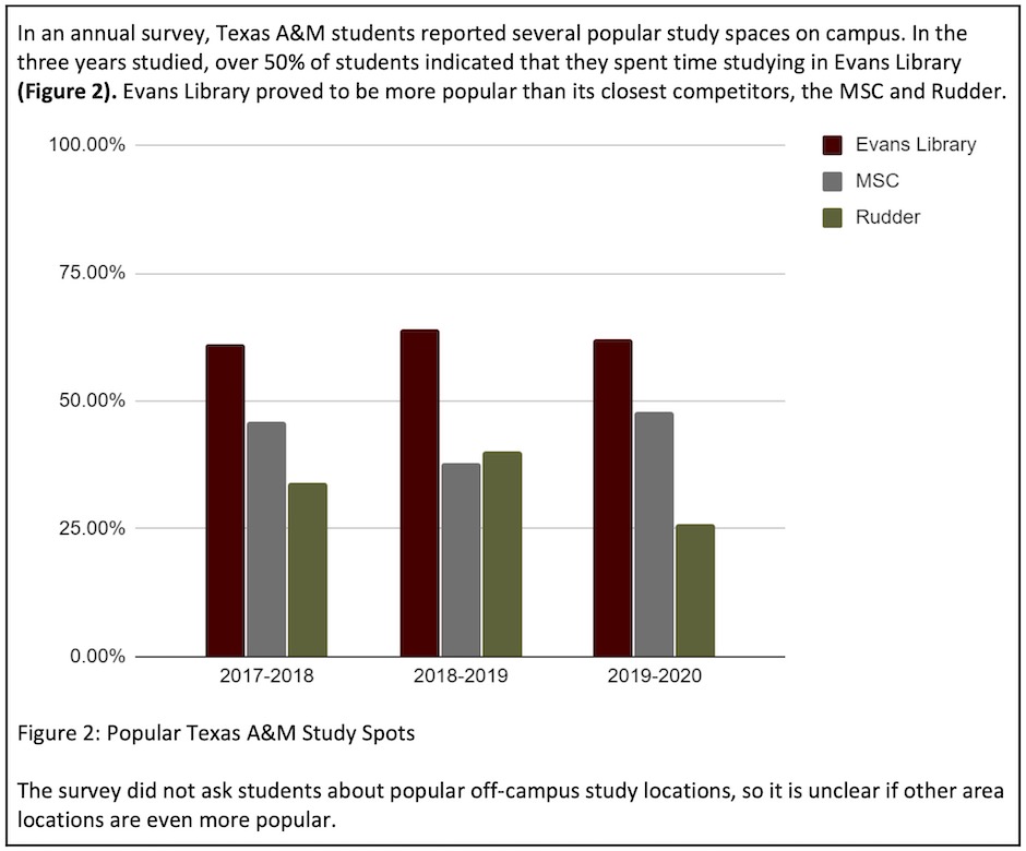
Any figures or tables you use in your document must be discussed in your text. Use the following guidelines when discussing and referring to tables and figures (as illustrated in Figure 8.5[1]):
- Whenever you use a chart or graph, provide some explanation of what is going on in the graphic, how to interpret it, what its basic trends are, and so on.
- Place the table/figure close to where it is first referred to in the text (preferably immediately below the paragraph in which it is first mentioned).
- Refer to tables and figures in your text by their numbers, not their placement in the text. For example, “See Figure 9 for a detailed schematic” (not “see the figure below”); “the test results are summarized in Table 1.”
- When referring to a figure or table in your body text, it is helpful to place the reference in bold font.
Captions (Labels, Titles, and Citations)
Tables and figures must all be labeled with numbered captions that clearly identify and describe them. Captions should immediately identify what the figure or table represents for the reader. Table captions must be placed above the tables because we generally read tables from the top down, and therefore want to see the caption at the top. In contrast, figures are not always read from top to bottom, so figure captions are generally placed below the figures. If you choose to place figure captions above the figures, however, do so consistently throughout your document.
Use the following conventions to assist the reader in understanding your graphics:
Numbering. Tables and figures are numbered sequentially but separately. For example: Table 1, Table 2, Figure 1, Figure 2, Table 3, etc.
Figure and Table titles. For most figures and tables, you’ll want to include a title. Readers need some way of knowing what they are looking at and a convenient way of naming and discussing the illustration other than by its number alone.
Captioning. After the figure or table number, add a descriptive title that clearly indicates what the figure or table illustrates without having to read anything else on the page. Be sure to cite the source of any information you borrowed to create the graphic or to cite the source of the graphic itself.
There are two systems for numbering figures and tables within your document:
Simple Consecutive Numbering. All figures and tables are numbered consecutively (Figure 1, Figure 2, Figure 3, Table 1, Table 2, Table 3, etc.) throughout the document regardless of which section they are in.
Section-based Numbering. Within each section, figures and tables may be numbered sequentially through each section (e.g. Table 1.1 refers to the first table in section 1; Table 2.4 refers to the fourth table in section 2).
If a large number of illustrations are presented, section-based numbering is the better choice; however, this can become confusing when the sections of text include sub-sections. Carefully weigh and choose which of the above systems of numbering figures and tables will be the clearest one to use for your particular document.
Finally, alter the font of your captions to distinguish them from body text. Caption font is usually the same type of font (such as Calibri or Times New Roman), but it is slightly smaller than body font and sometimes italicized. The label and number (for example, “Figure 1; Table 3.5”) are often both bolded in their corresponding graphic’s caption and in the body text.
Figures 8.6 and 8.7 demonstrate the difference that clear labeling, titles, captions, and key/legends can make in clarifying the meaning of a figure.
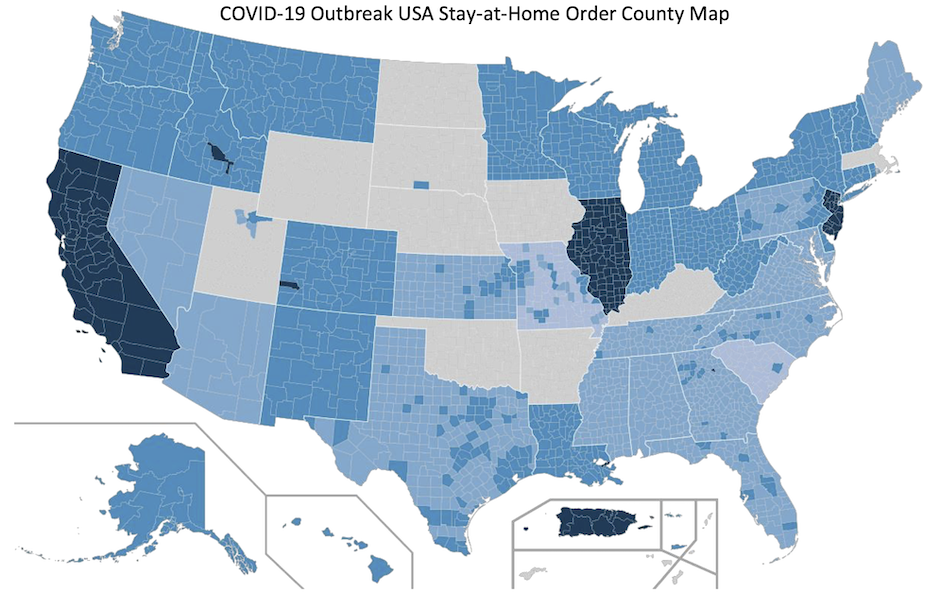
Can you understand what Figure 8.6[2] is trying to say? You may know the United States well enough to recognize state lines and the lighter county lines. Could you do the same if it was a map of South America or Europe? Some might be able to, but many would not. In addition, what do the colors actually mean? When during the pandemic is this information from? When was the information on this map accurate? What limitations or restrictions apply to the information here?
Consider this version of the map:
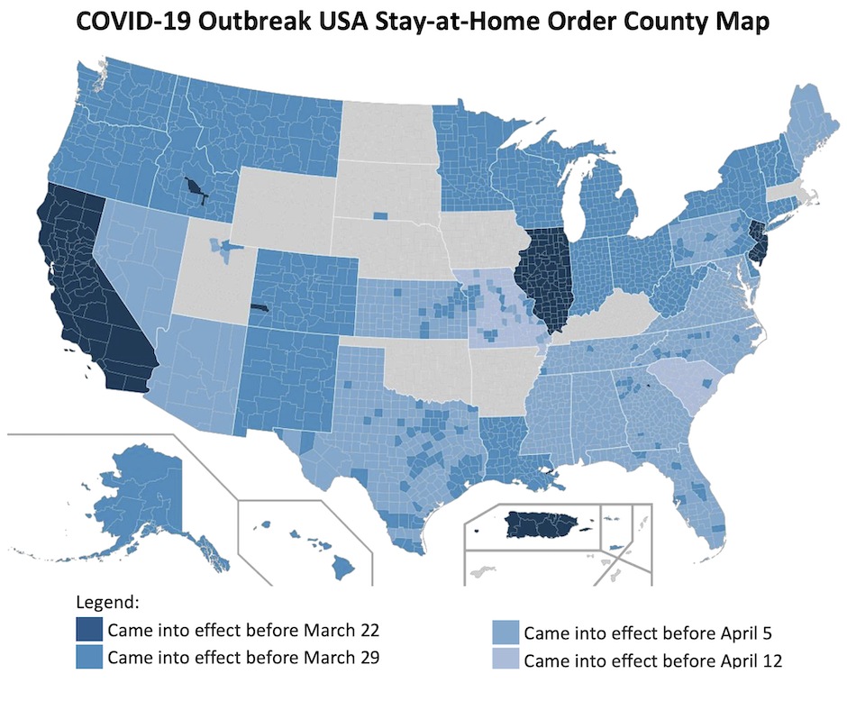
Figure 8.7[3] has a numbered label, a descriptive title, an explanatory caption, and a properly labelled legend. The caption also cites the source the graph was retrieved from, using an in-text citation that is linked to a full reference below. The original image has not been distorted in any way. Altogether, the title, explanatory caption with appropriate citation, and the clear legend make the figure readable, useful, and credible, unlike the previous figure, despite still not being completely accessible.
Documenting Graphics
If the table or figure that you present in your report was not created by you and instead comes from other sources, you must include a reference for the original source in your caption, such as “Figure 1. Network Design (Smith, 2015).”
Data used from outside sources to create a figure or table must also be cited. You must ensure that all figures and tables represent data accurately and ethically, and that they do not distort data to create bias. You need to cite the original dataset because it’s important for readers to be able to understand where the data being represented in a graphic originates, and it’s expected ethically that you credit the source of your data.
This text was derived from
Last, Suzan, with contributors Candice Neveu and Monika Smith. Technical Writing Essentials: Introduction to Professional Communications in Technical Fields. Victoria, BC: University of Victoria, 2019. https://pressbooks.bccampus.ca/technicalwriting/. Licensed under a Creative Commons Attribution 4.0 International License.
McMurrey, David. Online Technical Writing. n.d. https://www.prismnet.com/~hcexres/textbook/. Licensed under a Creative Commons Attribution 4.0 International License.
- Sarah LeMire, “Example of a Column Chart,” 2020. Licensed under a Creative Commons Attribution-NonCommercial-ShareAlike 4.0 International License. ↵
- Mihn Nguyen, “COVID-19 Outbreak USA Stay-at-Home Order County Map,” Wikimedia Commons, uploaded May 4, 2020, File:COVID-19_outbreak_USA_stay-at-home_order_county_map.svg. Made available under the Creative Commons CC0 1.0 Universal Public Domain Dedication. ↵
- Kalani Pattison added a legend to Mihn Nguyen, “COVID-19 Outbreak USA Stay-at-Home Order County Map,” Wikimedia Commons, uploaded May 4, 2020, File:COVID-19_outbreak_USA_stay-at-home_order_county_map.svg. Made available under the Creative Commons CC0 1.0 Universal Public Domain Dedication. ↵
