3 – Ethics in Workplace Culture and Research
Typical Ethics Issues in Technical Writing
Matt McKinney; Kalani Pattison; Kathy Anders; Suzan Last; Annemarie Hamlin; Chris Rubio; Michele DeSilva; Eleanor Sumpter-Latham; and Nicole Hagstrom-Schmidt
There are a few issues that may arise when a writer is researching a topic for the business or technical world.
Research that Does Not Support the Project Idea
In a technical document that contains research, you might discover conflicting data that does not support the project’s goal. For example, your small company has problems with employee morale. Research shows that bringing in an outside expert, someone who is unfamiliar with the company and the stakeholders, has the potential to enact the greatest change. You discover, however, that bringing in such an expert is cost prohibitive. Should you leave this information out of your report, thereby encouraging your employer to pursue an action that is really not feasible? Conversely, should you include the information at the risk of not being able to offer the strongest solution?
Suppressing Relevant Information
Suppressing relevant information can include a variety of factors, including the statistical significance of data or the researchers’ stake in the findings. For example, a study in 2015 found that driving while dehydrated is about as dangerous as driving while under the influence of alcohol. While this was widely reported in popular news sources, these sources failed to highlight some of the most important aspects of the study. To begin with, the study was conducted using just 12 people, and only 11 of them reported data. Furthermore, the study was conducted by an organization called the European Hydration Institute, which in turn is a think-tank subsidiary of the Coca-Cola corporation. In other words, not only was the sample size far too small to make this claim, but the data collection was designed and implemented by a corporation with a stake in the findings, since they profit off the sale of hydration products.[1] This case illustrates the ethical dubiousness of suppressing important contextual information for the sake of a sensational headline.
Not Verifying Sources Properly
Whenever you incorporate others’ ideas into your documents, especially quotations, make sure that you are attributing them to the correct source. Mark Twain, supposedly quoting British Prime Minister Benjamin Disraeli, famously said, “There are three kinds of lies: lies, damned lies, and statistics.”[2] On the other hand, H.G. Wells has been (mis)quoted as stating, “statistical thinking will one day be as necessary for efficient citizenship as the ability to read and write.”[3] When using quotes, even ones from famous figures that regularly appear as being commonly attributed to a particular person, it is important to verify the source of the quote. Such quotes often seem true, because the ideas they present are powerful and appealing. However, it is important to verify the original source both because you need to make sure that your quote is, in fact, correct, and that it is not being taken out of context from the original source. The effective use of statistics can play a critical role in influencing public opinion as well as persuading in the workplace. However, as the fame of the first quotation indicates, statistics can be used to mislead rather than accurately inform—whether intentionally or unintentionally.
Presenting Visual Information Ethically
Visuals can be useful for communicating data and information efficiently for a reader. They provide data in a concentrated form, often illustrating key facts, statistics, or information from the text of the report. When writers present information visually, they have to be careful not to misrepresent or misreport the complete picture. Many of the guidelines for designing informational graphics in Chapter 8 are meant to help ensure that you present your data ethically, primarily by not misleading readers and by ensuring access for as many readers as possible.
Figure 3.1[4] below shows information in a pie chart from two different perspectives. The data in each is identical, but the pie chart on the left presents information in a misleading way. What do you notice about how that information is conveyed to the reader?
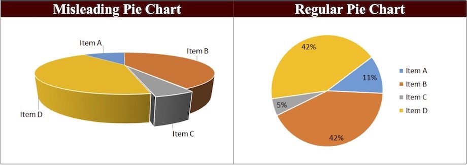
Imagine that these pie charts represented donations received by four candidates for city council. The candidate represented by the gray slice labeled “Item C” might think that she had received more donations than the candidate represented in the blue “Item A” slice. In fact, if we look at the same data in the 2D chart, we can see that Item C represents fewer than half of the donations compared to those for Item A. Thus, a simple change in perspective can change the impact of an image.
Similarly, take a look at the bar graphs in Figure 3.2[5] below. What do you notice about their presentation?
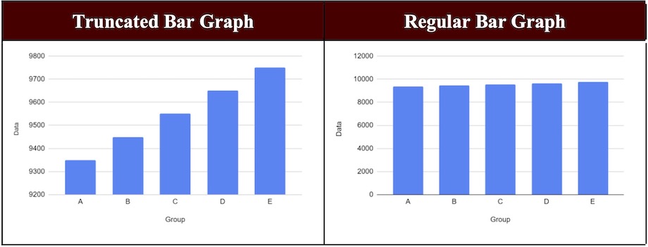
If the bar graph above were to represent sales figures for a company, the representation on the left would look like good news: dramatically increased sales over a five-year period. However, a closer look at the numbers reveals that the graph shows only a narrow range of numbers in a limited perspective (9100 to 9800). The bar graph on the right, on the other hand, shows the complete picture by presenting numbers from 0-1200 on the vertical axis, and we see that the sales figures have in fact been relatively stable for the past five years.
Presenting data in graphical form can be especially challenging. As you prepare your graphics, keep in mind the importance of providing appropriate context and perspective.
Limited Source Information in Research
Thorough research requires you to incorporate and synthesize information from a variety of reliable sources. Your document or presentation should demonstrate that you have examined the topic from as many angles as possible. Thus, your sources should include scholarly and professional research from a variety of appropriate databases and journals, as opposed to just one author or website. Using a range of sources helps you avoid potential bias that can occur from relying on only a few experts. For example, if you were writing a report on the real estate market in Central Texas, you would not collect data from only one broker’s office. While this office might have access to broader data on the real estate market, as a writer you run the risk of looking biased if you only chose materials from this one source. Collecting information from multiple brokers would demonstrate thorough and unbiased research. The next section of this chapter focuses on the ramifications of bias in more detail.
This text was derived from
Hamlin, Annemarie, Chris Rubio, and Michele DeSilva, “Typical Ethics Issues in Technical Writing,” licensed under a Creative Commons Attribution 4.0 International License. In Gross, Allison, Annemarie Hamlin, Billy Merck, Chris Rubio, Jodi Naas, Megan Savage, and Michele DeSilva. Technical Writing. Open Oregon Educational Materials, n.d. https://openoregon.pressbooks.pub/technicalwriting/. Licensed under a Creative Commons Attribution-NonCommercial-ShareAlike 4.0 International License.
Last, Suzan, with contributors Candice Neveu and Monika Smith. Technical Writing Essentials: Introduction to Professional Communications in Technical Fields. Victoria, BC: University of Victoria, 2019. https://pressbooks.bccampus.ca/technicalwriting/. Licensed under a Creative Commons Attribution 4.0 International License.
- Reed, Ryan. “Watch John Oliver Call Out Bogus Scientific Studies.” Rolling Stone, May 9, 2016. https://www.rollingstone.com/tv/tv-news/watch-john-oliver-call-out-bogus-scientific-studies-60448/; LastWeekTonight. “Scientific Studies: Last Week Tonight with John Oliver (HBO).” YouTube, May 8, 2016. https://www.youtube.com/watch?v=0Rnq1NpHdmw. ↵
- Mark Twain, Mark Twain’s Autobiography, Volume 1, produced by Don Lainson, (Project Gutenberg of Australia, 2002), Project Gutenberg Australia. ↵
- This particular quote comes from Samuel S. Wilkes, who is misquoting H.G. Wells. S.S. Wilkes, “Undergraduate Statistical Education,” Journal of the American Statistical Association, 46, no. 253 (March 1951): 5, https://doi.org/ 10.1080/01621459.1951.10500763. ↵
- Derived from Annemarie Hamlin, Chris Rubio, and Michele DeSilva, “Misleading and Regular Pie Charts,” in “Typical Ethics Issues in Technical Writing,” licensed under a Creative Commons Attribution 4.0 International License, in Gross, Allison, Annemarie Hamlin, Billy Merck, Chris Rubio, Jodi Naas, Megan Savage, and Michele DeSilva, Technical Writing, (Open Oregon Educational Materials, n.d.), https://openoregon.pressbooks.pub/technicalwriting/. Licensed under a Creative Commons Attribution-Noncommercial-ShareAlike 4.0 International License. ↵
- Derived from Annemarie Hamlin, Chris Rubio, and Michele DeSilva, “Truncated and Regular Bar Graphs” in “Typical Ethics Issues in Technical Writing,” licensed under a Creative Commons Attribution 4.0 International License, in Gross, Allison, Annemarie Hamlin, Billy Merck, Chris Rubio, Jodi Naas, Megan Savage, and Michele DeSilva, Technical Writing, (Open Oregon Educational Materials, n.d.), https://openoregon.pressbooks.pub/technicalwriting/. Licensed under aCreative Commons Attribution-Noncommercial-ShareAlike 4.0 International License. ↵
