8 – Graphics
Tables
Suzan Last; David McMurrey; James Francis, Jr.; Nicole Hagstrom-Schmidt; and Claire Carly-Miles
Tables are made up of rows and columns that contain data, usually in numerical form. They permit rapid access to and relatively easy comparison of information. If the data is arranged chronologically (for example, sales figures over a ten-year period), the table can show trends (for example, patterns of rising or falling activity). Of course, tables are not necessarily the most vivid or dramatic means of showing such trends or relationships between data—that’s why we have charts and graphs. These figures are discussed in greater detail later in the chapter.
Uses for Tables
Tables are used to organize detailed data and information into categories for comparison. The most typical use of tables is for large amounts of numerical data, so tables should be used when exact figures are important. Tables also have an added advantage over charts and graphs by being able to compare multiple factors, whereas a 2D chart can only compare two variables. For example, imagine that you are comparing different models of laser printers in terms of physical characteristics such as height, depth, length, weight, and so on. A table is perfect for demonstrating and allowing comparison of the exact measurements of these specific printer models.
However, tables are not only used for numerical data. They may also be used to organize multiple qualitative categories that are best expressed using words. A qualitative category could be something like color, a ranking such as “Good” or “Ineffective,” or even a definition of a concept. Imagine again that you are comparing several models of a laser printer. As part of your evaluation, you would use different categories (such as cost, print speed, cost of ink, warranty) as criteria. These criteria would be ideal content for a table that uses words rather than numbers.
Effective Table Format and Design
When formatting your tables, there are several guidelines you should follow in order to increase their usability for your audience.
Title. Traditionally, the title of a table is placed on top of the table or is the first row of the table, rather than below. This is because tables are usually read from top to bottom, so it makes sense that the title would be in the first place a reader looks. The tables in this textbook are formatted according to this principle. To provide a title for your table, first include an identifier. This identifier will usually be the label “Table” combined with a number. Tables should be numbered sequentially, with the first table appearing in your report being labeled as Table 1, the second table labeled as Table 2, and so on. Conclude the label with a period. After the label, provide a descriptive title that identifies the content of the table. This title may be formatted in “sentence case,” with only the first word and any proper nouns capitalized, or in “title case,” with all words other than non-primary articles or prepositions being capitalized. Whichever you choose, make sure it is consistent across all tables and figures. For an example of how to title a table and other figures, see “Captions (Labels, Titles, and Citations)” later in this chapter. In addition, consider how figures and tables are labeled throughout this text.
Headings. Another major formatting feature of tables is the use of headings. Headings are used at the top of each column (where they are called box heads) and on the leftmost-side of each row (where they are called stubs). These headings are used to identify the content being provided in their given row or column. When providing a heading for a column that has numerical data, include the units for that column in the header rather than in each individual cell.
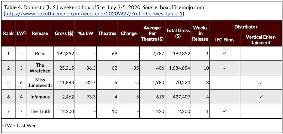
When it comes to headings, formatting becomes more complicated when rows or columns must be grouped or subdivided. In such cases, you have to create row or column subheadings. Figure 8.1[1] illustrates a way to handle this challenge. In this table, there are twelve total columns. Ten of these columns are given headings in cells of the same height. The Distributor information is first identified in an eleventh column. This information is immediately sub-divided into two separate columns and given headings below. Combined, these cells make up the same height as the rest of the row with headings.
Alignment. Left-align or center-align words and phrases in table columns (including the column heading). Right-align numeric data in table columns.
Footnotes and Citation. The final item to consider when formatting a table is whether to add a note or caption below the table itself. There are three types of notes you may use for a table: general, specific, and probability. General notes refer to general information included in a table, such as an explanation of the data source or a citation. Citations are formatted as in-text citations that follow your chosen style guide. General notes appear first and include a label such as “Note:”; “Source:”; or “Data from” (without quotation marks). Specific notes are reserved for specific details about a column, row, or cell. These notes go below any general notes and are labeled with a superscript number or letter that corresponds to a specific place on the table. Finally, probability notes provide information on probability testing. These notes appear last, after any general or specific notes. They do not contain a label. When there is some special point you need to make about one or more of the items in the table, use a footnote instead of clogging up the table with the information
Effectively Integrating Tables into Your Document
In order to integrate tables into your document effectively, include text that precedes the table and explains the general significance of the data in the table. Don’t expect readers to figure out the table entirely for themselves. Also, be sure that you don’t overwhelm your readers with extremely large tables; include only the amount of data needed in order to illustrate your point.
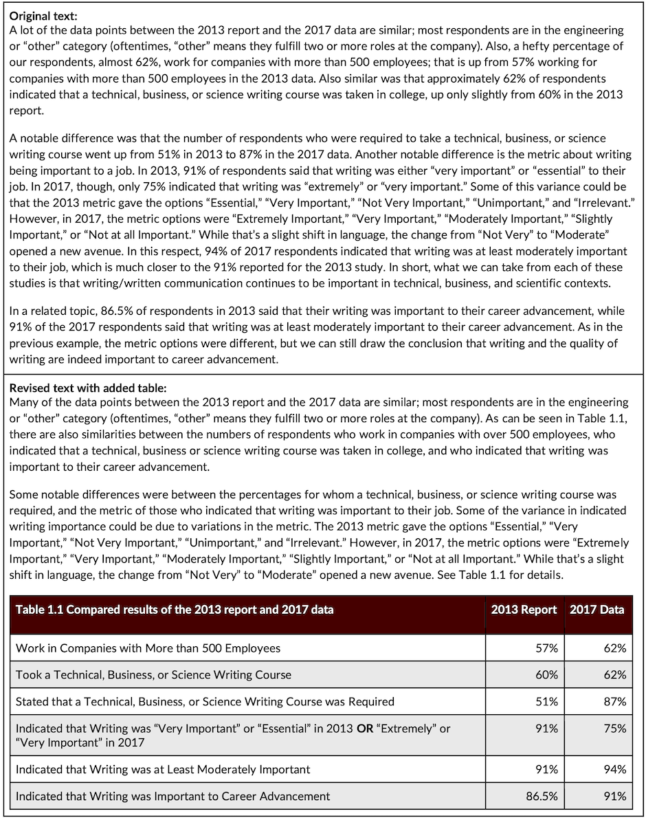
Occasionally, rough drafts of technical reports present information in regular running-text form that could be better presented in table (or tabular) form. When revising, review your rough drafts for material that can be transformed into tables. Figure 8.2[2]below shows an example of how to revise a draft by converting information into a table format. Note how the writer pulls the specific data points from the paragraphs and places them into a table for easy reference. Note also that in the revised paragraphs below, the points in the text also clearly introduce and link to the information in the table. These details help fully integrate the table into the document and make the overall text easier to quickly read and understand.
This text was derived from
Last, Suzan, with contributors Candice Neveu and Monika Smith. Technical Writing Essentials: Introduction to Professional Communications in Technical Fields. Victoria, BC: University of Victoria, 2019. https://pressbooks.bccampus.ca/technicalwriting/. Licensed under a Creative Commons Attribution 4.0 International License.
McMurrey, David. Online Technical Writing. n.d. https://www.prismnet.com/~hcexres/textbook/. Licensed under a Creative Commons Attribution 4.0 International License.
- James Francis, “Table of Domestic Weekend Box Office Revenues, July 3-5, 2020,” 2020. Licensed under a Creative Commons Attribution-NonCommercial-ShareAlike 4.0 International License. Created using data derived from Box Office Mojo, “Domestic 2020 Weekend 27,” accessed August 14, 2020, https://www.boxofficemojo.com/weekend/2020W27/?ref_=bo_wey_table_2_table_2. ↵
- Kalani Pattison, “Revising Text into Tables,” 2020. Licensed under a Creative Commons Attribution-NonCommercial-ShareAlike 4.0 International license. Derived from Jason Swarts, Stacey Pigg, Jamie Larsen, Julia Helo Gonzalez, Rebecca De Haas, & Elizabeth Wagner, Communication in the Workplace: What Can NC State Students Expect? (Raleigh: North Carolina State University Professional Writing Program, 2018). https://docs.google.com/document/d/1pMpVbDRWIN6HssQQQ4MeQ6U-oB-sGUrtRswD7feuRB0/edit#heading=h.n2a3udms5sd5. Licensed under a Creative Commons Attribution 4.0 International License. ↵
Headings used at the top of each column in a table.
Headings used on the leftmost side of each row in a table.
